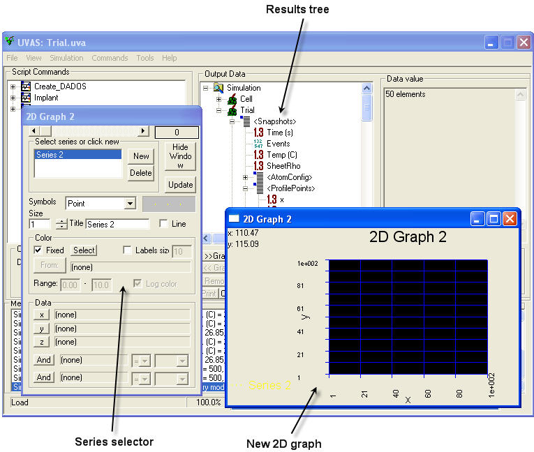
For all cases, please create a new 2D or 3D graph, as required. After that, open the results tree and double click on the draw area in order to open Series Selector.
You can use all the graphs you want and save them. For doing this, click on View -> Save graphics. A GPH file will be created, that can be opened for other simulations (it is not compulsory to use it with the same type of simulation as this file does only work with the data structure, but not with specific scripts).
You only need to know what you want to plot. Remember data and snapshots structures. Choose parameters to be shown in the Data Browser and, when selected, click on "x", "y" or "z" in the Series Selector. Let´s see some examples:
Plotting the concentration of a mobile type of particle versus depth.
Plotting the concentration of an immobile type of particle versus depth.
Plotting the concentration of a type of particle versus time.
Plotting the concentration of a type of particle versus temperature.
Plotting only some structures from the atomic configuration.
Plotting amorphous pockets histograms (II): I and V contained.
See carriers and Fermi levels.
A new 2D graph is required for this.
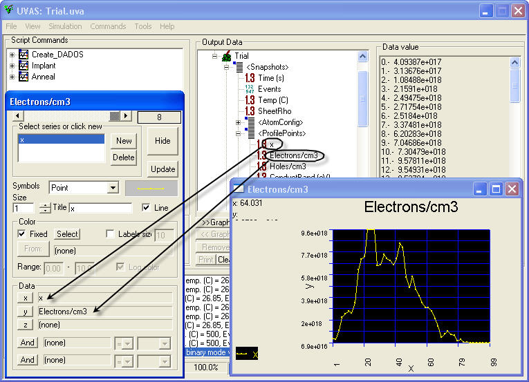
Select <Snapshots> item in the Data browser and then click on "Last Value". We are going to plot only the last snapshot, corresponding to the last simulated time (click here to learn how to plot different times).
Open <ProfilePoints> and select "All Values", because we want to see all the information from the last snapshot.
Select "x" and click on "x" in the Series Selector.
Do the same with "Electrons/cm3" and "y".
Click on "Update".
This method is also valid to plot conduction band, valence band, biaxial strain, Ge fraction and Ge concentration.
See concentrations.
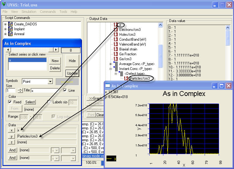
A new 2D graph is required for this.
Select <Snapshots> item in the Data browser and then click on "Last Value". We are going to plot only the last snapshot, corresponding to the last simulated time (click here to learn how to plot different times).
Open <ProfilePoints> and select "All Values", because we want to see all the information from the last snapshot.
Select "x" and click on "x" in the Series Selector.
Click on "Instant.Conc.<P_type>" and select "Index", where you will be able to choose the type of particle (I, V, dopants,...).
Do the same for <Defect type> and choose the state of the particle (point defect, amorphous,...). Remember you will get plotted here only immobile particles, such as I or V in clusters, amorphous pockets, substitutional dopants,...
Click on "y" while "Profile" is selected and update the graph.
See concentrations.
A new 2D graph is required for this.
Select <Snapshots> item in the Data browser and then click on "Last Value". We are going to plot only the last snapshot, corresponding to the last simulated time (click here to learn how to plot different times).
Open <ProfilePoints> and select "All Values", because we want to see all the information from the last snapshot.
Select "x" and click on "x" in the Series Selector.
Click on "Average Conc.<P_type>" and select "Index", where you will be able to choose the type of particle (I, V, dopants,...). Remember you will get plotted here only mobile particles, such as free I or V, interstitial dopants,...
Click on "y" while "Particles/cm3" is selected and update the graph.
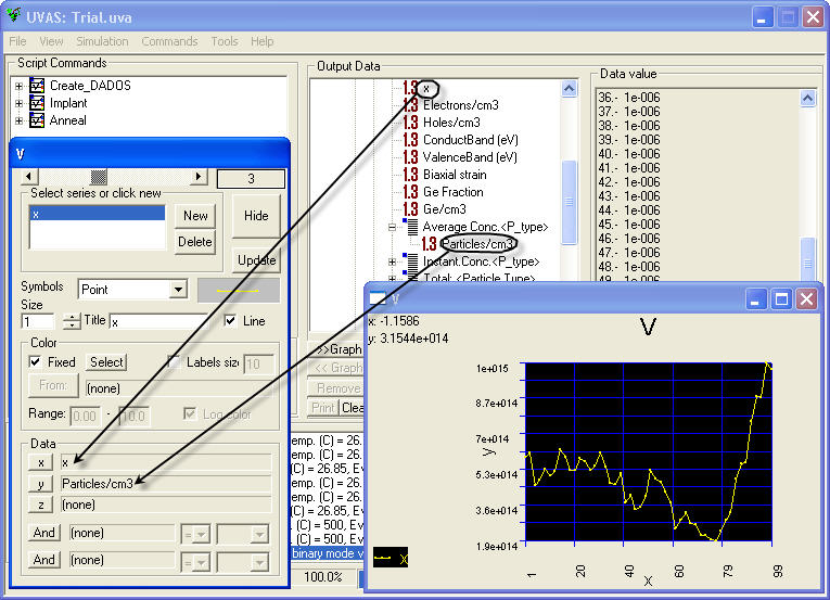
Notice that the concentration here is much lower than in the case of immobile particles, in agreement with theoretical results.
The last option in <ProfilePoints> is "Total: <Particle Type>" which is obviously used to plot both mobile and immobile particles. The algorithm followed to do it is exactly the same than for plotting mobile particles.
See concentrations.
A new 2D graph is required for this.
Select <Snapshots> item in the Data browser and then click on "All Values". We are going to plot all the snapshots, as we want to see the entire simulation.
While "Time" item selected, click on "x" in Series selector.
Open <ProfilePoints>, select "Index", and choose the type of particle. If you want to plot immobile particles, do exactly the same for "Instant.Conc.<P_type>" and finally, choose the state of the particle from the "Index" item in <Defect type>. If you want to plot mobile particles, do the same for "Average Conc.<P_type>".
Click on "y" while Profile is selected and update the graph.
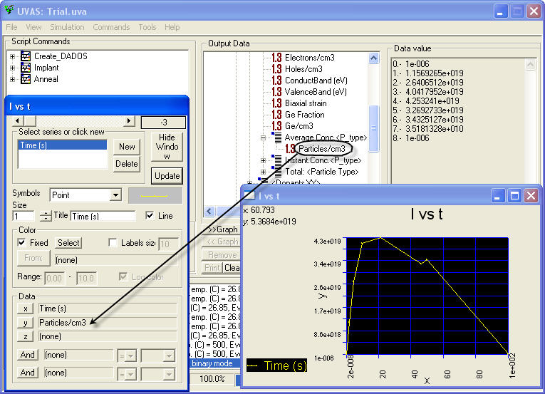
See concentrations.
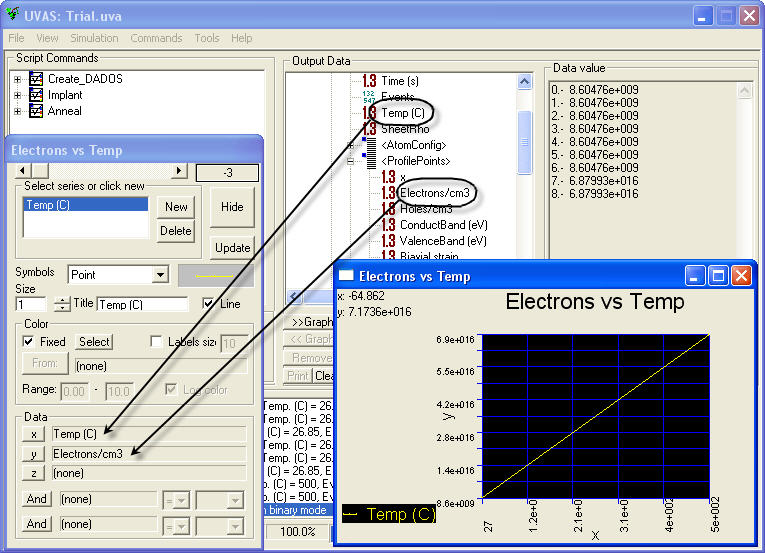
Plotting a concentration versus temperature is similar to the plot versus time. Let's give an example with the number of electrons.
A new 2D graph is required for this.
Select <Snapshots> item in the Data browser and then click on "All Values". We are going to plot all the snapshots, as we want to see the entire simulation.
While "Temperature" item selected, click on "x" in Series selector.
Open <ProfilePoints> and select "Last Value".
While "Electrons/cm3" item selected, click on "y" in Series selector.
Click on "Update".
A new 3D graph is required for this.
Select <Snapshots> item in the Data browser and then click on "Last Value". We are going to plot only the last snapshot, corresponding to the last simulated time (click here to learn how to plot different times).
Open <AtomConfig> and select "All Values", because we want to see all the information from the last snapshot.
While selected <AtomConfig>, click on "x" and the three dimensions will be automatically set in the Series Selector.
Click "Update" to plot.
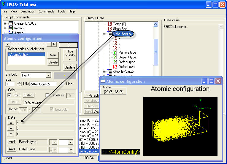
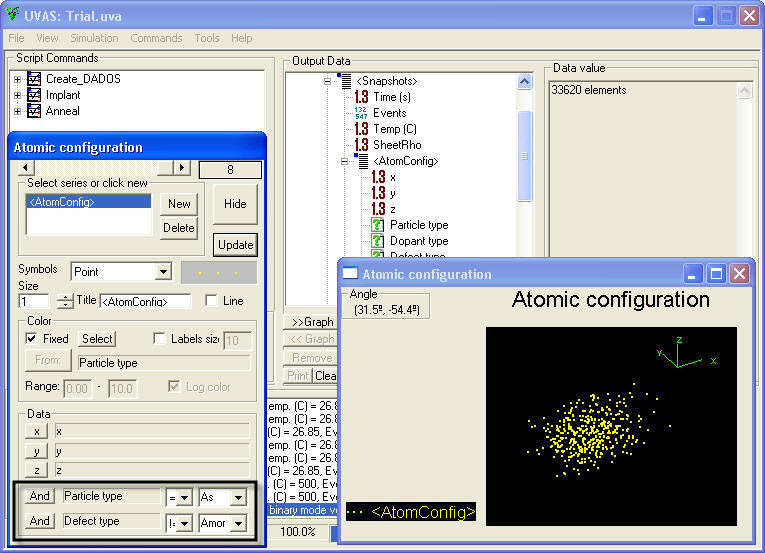
If we uncheck the "Fixed" option, UVAS will draw with different colors according to the type of particle:
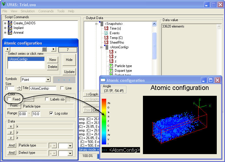
Let's supposse we have an atomic configuration plotted on a 3D graph. Series selector provides with a tool for selecting only some particles to be drawn. First of all, the particle type must be chosen (I, V, dopants,...), and then, if necessary, a configuration can be, as well, selected (amorphous, I311,...). UVAS allows to select different conditions in order to provide a wide range of possibilities, such as plotting only I in 311 (==), everything but I (!=), etc. When you have everything defined, please click on "Update". In the figure below, we have plotted arsenic in any configuration except in amorphous:
| Particle type | == | As |
| Defect type | != | Amorphous |
This is valid for both 2D and 3D graphs, but not plots versus time obviously.
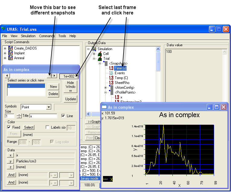
Once plotted, please move up to the last frame.
Select the "Time" item in the results tree and click on the indicated part of the Series Selector.
When moving the bar, graph will be automatically updated. Notice that now, in the box next to this bar, the time will be shown.
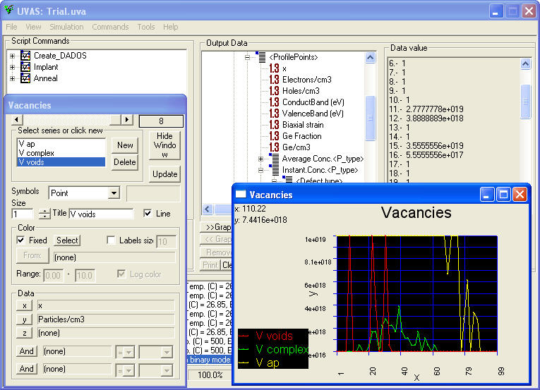
See amorphous pockets.
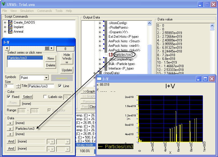
Use this solution in order to plot the number of I+V or min(I,V) versus depth. A new 2D graph is required for this.
Select <Snapshots> item in the Data browser and then click on "Last Value". We are going to plot only the last snapshot, corresponding to the last simulated time (click here to learn how to plot different times).
Open "AmPock histo" (the one you prefer, <minIV> or <IplusV>) and select "All Values", because we want to see all the information from the last snapshot.
While selected "Particles/cm3", click on "y" in the Series Selector.
Click "Update" to plot.
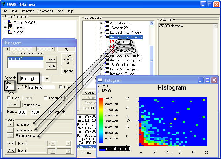
See amorphous pockets.
Use this solution in order to plot the number of I and V contained in the amorphous pockets. A new 2D graph is required for this.
Select <Snapshots> item in the Data browser and then click on "Last Value". We are going to plot only the last snapshot, corresponding to the last simulated time (click here to learn how to plot different times).
Open "AmPock histo: <Struct>" and select "All Values", because we want to see all the information from the last snapshot.
While selected "number of I", click on "x" in the Series Selector.
Do the same for "number of V" and "y", and for "Particles/cm3" and "z".
In the Series Selector, use "Rectangle" as a symbol with a big size in order to get an homogeneous result.
Uncheck the "Fixed" option and click on "From" button. Automatically, "Particles/cm3" will appear in the box on the right. This means we are going to use a range of colors to plot the different amount of amorphous pockets of each size.
Now, we have to define the limits: the lower is usually zero, and the top level is normally set to a value a bit higher than the highest in the results vector, which can be seen in the Data viewer by clicking on "Particles/cm3". For very large spans, it is highly recommended to check the option "Log color".
As we can see in the picture below, the plot shows the different amount of amorphous pockets in the simulation. Abscissas axis indicates the number of interstitials, while ordinates axis is used for the number of vacancies. Actually, it is a 3D plot in which the third coordinate is plotted by means of colors.
See complexes.
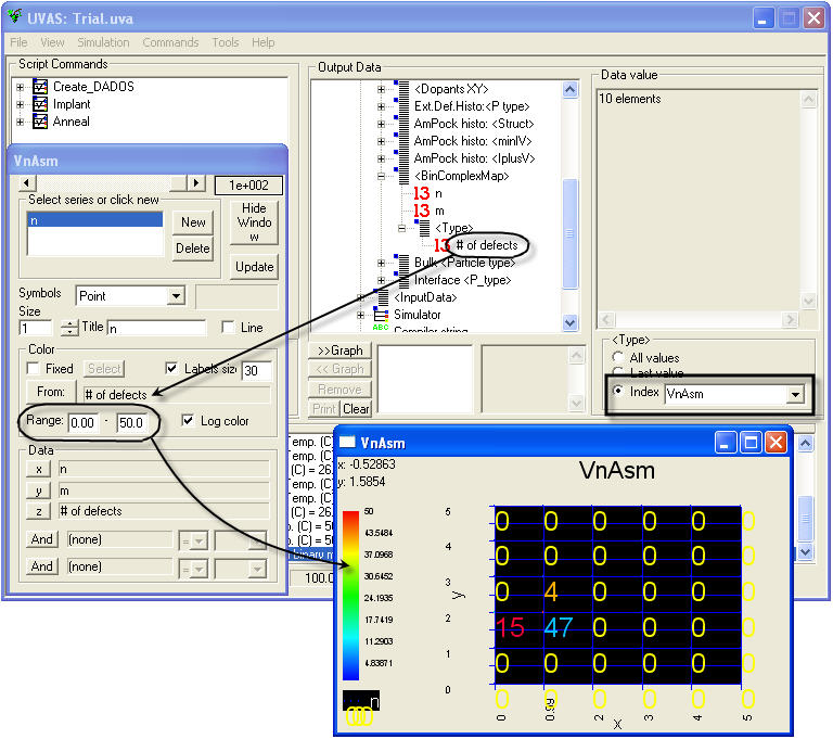
Use this solution in order to plot the number of particles contained in complexes. A new 2D graph is required for this.
Select <Snapshots> item in the Data browser and then click on "Last Value". We are going to plot only the last snapshot, corresponding to the last simulated time (click here to learn how to plot different times).
Open "<BinComplexMap>" and select "All Values", because we want to see all the information from the last snapshot.
While selected "n", click on "x" in the Series Selector.
Do the same for "m" and "y".
Open "<Type>" and and choose one of the available options for complexes: InBm, InCm, VnAsm, VnOm, VnFm, VnPhm. Index "n" represents the number of native defects in the complex and index "m" represents the number of dopants in the complex.
While selected "# of defects" in the Data browser, uncheck the "Fixed" option and click on "From" button. Automatically, "# of defects" will appear in the box on the right. This means we are going to use a range of colors to plot the different amount of amorphous pockets of each size.
Now, we have to define the limits: the lower is usually zero, and the top level is normally set to a value a bit higher than the highest in the results vector, which can be seen in the Data viewer by clicking on "# of defects". For very large spans, it is highly recommended to check the option "Log color".
As we can see in the picture below, the plot shows the different amount of complexes in the simulation. Abscissas axis indicates the number of interstitials, while ordinates axis is used for the number of dopants. UVAS limits both "n" and "m" with a maximum of 9 each one.
See complexes.
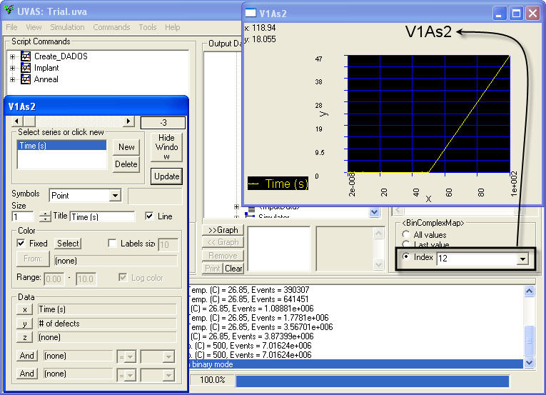
Remember how to plot complex maps. Index "n" is used by UVAS to represent number of I or V and index "m" was employed for number of dopants. If we want to represent the number of a complex, such as VnAsm, we have to represent it just by indicating subindex "nm". For example, for V1As2, set index "12".
A new 2D graph is required for this.
Select <Snapshots> item in the Data browser and then click on "All Values". We are going to plot all the snapshots, as we want to see the entire simulation.
While "Time" item selected, click on "x" in Series selector.
Open <BinComplexMap>, select "Index", and choose the index correspondent to the complex you want to plot.
Click on "Type" and choose the generic complex.
Click on "y" while "# of defects" is selected and update the graph.
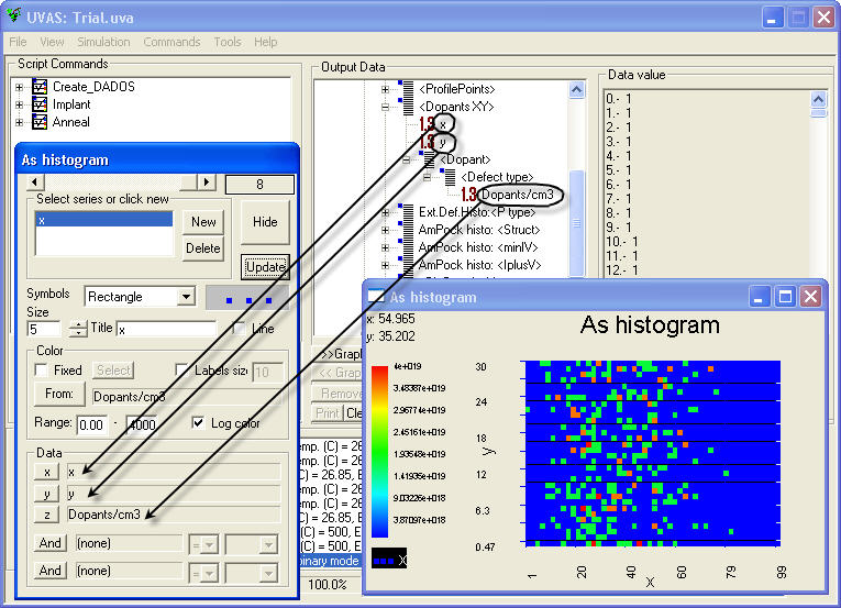
Use this solution in order to plot the concentration of dopants contained in a projection over the XY plane. A new 2D graph is required for this.
Select <Snapshots> item in the Data browser and then click on "Last Value". We are going to plot only the last snapshot, corresponding to the last simulated time (click here to learn how to plot different times).
Open <DopantsXY> and select "All Values", because we want to see all the information from the last snapshot.
While selected "x", click on "x" in the Series Selector.
Do the same for "y" and "y".
In the "Dopants" section, select the dopant from the "Index" part. Select also the "Defect type", which can be complex or point defect.
While selected "Dopants/cm3", select "z" in the Series Selector.
In the Series Selector, use "Rectangle" as a symbol with a big size in order to get an homogeneous result.
Uncheck the "Fixed" option and click on "From" button. Automatically, "Dopants/cm3" will appear in the box on the right. This means we are going to use a range of colors to plot the different concentration of dopant in each position.
Now, we have to define the limits: the lower is usually zero, and the top level is normally set to a value a bit higher than the highest in the results vector, which can be seen in the Data viewer by clicking on "Dopants/cm3". For very large spans, it is highly recommended to check the option "Log color".
As we can see in the picture below, the plot shows the different concentration of dopant. Abscissas axis indicates the X, while ordinates axis is used for the Y. Actually, it is a 3D plot in which the third coordinate is plotted by means of colors.
Obviously, you are only allowed to plot more than one graphs in the same draw area if abscissas are the same.
Create a new series in the Series Selector by clicking in "New".
Do the same as for plotting the former.
Use this way to plot as many data as required.